| Home | Job | Pinball | Photo Album | Automotive | Press/Awards | Contact |

The Plot of Tested Positive Cases
In March 2020, the numbers of cases in Aruba started to rise and I needed a way to mentally process this stream of data. I naturally decided to plot them. After a few days, I realized that the expected exponential growth would be useful to be plotted in logarithmic scale instead of the the more common linear scale. In my work, we use log plots all the time.

Cases tested positive on Aruba as of 4/4/2020 (linear scale)

Cases tested positive on Aruba ending May 2020 (log scale) with annotations.
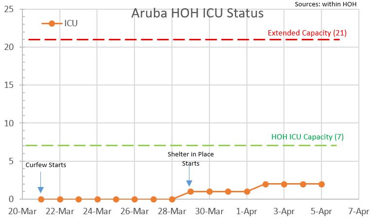
Initial version of the ICU load as of 4/4/2020
In March 2020, the numbers of cases in Aruba started to rise and I needed a way to mentally process this stream of data. I naturally decided to plot them. After a few days, I realized that the expected exponential growth would be useful to be plotted in logarithmic scale instead of the the more common linear scale. In my work, we use log plots all the time.
Cases tested positive on Aruba as of 4/4/2020 (linear scale)
Cases tested positive on Aruba ending May 2020 (log scale) with annotations.
A
normal exponential growth when plotted on linear scale keeps growing
steeper and steeper as time goes on. As a result, the old data
gets really compressed and you lose the nuances, while the new data
just shows up as a steep slope. It can be hard to tell the future
progression. However, the logarithmic conversion compresses the
vertical scale so that data that grows exponentially looks like a
straight line. Humans are better at interpreting this, and you
can more readily understand it (to see past trends, predict the future,
etc).
As you can see with the annotated log scale plot above (data from the DVG site), we have been able to fit three trend lines to the data thus far and it can be concluded that we have had three different data population sets so far. Before 3/28 we were growing about a rate of 1.29x per day, while after that, it levelled off to 1.05x per day. After that, the growth slowed to near zero. It seems clear to me that the closing of the Air Border and the curfew combined to slow the growth to 5% per day and then the Shelter in Place reduced the rate to near zero.
The ICU plot
After plotting the above data and sharing it on my Facebook Page, I was contacted by staff at the Dr. Horacio Oduber Hospital in Aruba. They asked me to plot the hospital beds used and the ICU cases to keep track and to see if there was a trend. After some correspondence, we decided to focus on the ICU patient load in particular.
Initial version of the ICU load as of 4/4/2020
The
above figure shows the initial version which we first published on 4/5.
It is a good start to seeing the past and current status, but a
more useful thing would be to develop a model to predict the future.
We could then have a warning when we are about to hit capacity,
or know
when we need to prepare for expansion and how much time we have to do
it.
How models work
Let's say you are sending your kid to school. You decide to open a bank account. Let's say the account requires Afls100 in annual fees, it earns Afls 10% interest a year, the student needs Afls40 for monthly expenses, and you decide to start with a deposit of Afls 1000. How will you know how long the money will last? Well one way is to develop a model, and run a simulation to see how time progresses. The numbers above are our model, they get turned into equations that encode this model into a mathematical formulation. Then, we adjust coefficients in the equations so that the past data matches the model. This last step is called correlating the model with real world data. If the correlation is very tight, you can be confident the model is good. With that complete, we then can run a computer simulation to turn the clock forward and plot the results. As you can see in our example, the simulation is only going to be as good as the model. If we forget some aspect, the future data will not match our simulation, but at every step, we can adjust the model and rerun it to better our prediction of the future. We can also try "what-if" scenarios and change something to see the effect.
Other models
Other well-known models are the weather, stock market, viral infections etc. Anywhere we see rules occur and behavior that can be quantized, you can expect someone will develop a model. Our ICU model will be numeric, meaning that the results are numbers over time. But some models can be analytical, meaning they have solved the differential equations and come up with closed form solutions to the system.
Our ICU model
The ICU model will be simple to start. We can see the following behavior:
- From other countries and published data, the HOH sees that each patient spends a certain number of days in the ICU. We will start with the quantity of 21 days. This is how our number of patients will decrease over time.
- From the log plot of cases above, we see the current growth rate is about 5% a day. Assuming a known ratio of ICU cases per tested positive cases, we grow the ICU patient load by the same amount. Current info is that 3% of the positive cases end up in the ICU.
The
second rule above is how we link the two plots. As the "Tested
Positive" plot gets bigger, it will be more useful, and its output will
inform us of the ICU growth.
I will leave it up to my friends at the HOH to decide when we go public with the results of this model. For now, I will only show the past and current data.
I will leave it up to my friends at the HOH to decide when we go public with the results of this model. For now, I will only show the past and current data.
Links:
Official Dept of Health website on the count of cases
US cases plotted (note these are all log plots)
(c) 2020 Edward Cheung, all rights reserved.